Adhering to proper design and code standards makes a website accessible allowing those with disabilities and impairments to use a site. The WashU Web Theme uses a color palette that passes WCAG Level 2.0 AA Accessibility standards. This is evident when there is text on a background color. The most common examples of this are found in Billboard elements.
Need help with your website?
We can help you!
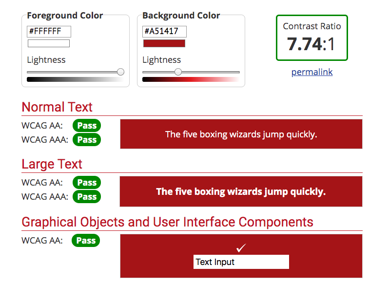
The below example shows white text on a red background. When using a contrast checker, such as this one: https://webaim.org/resources/contrastchecker/, we are able to determine how much contrast is visible. This is important so that those with color blind disabilities are able to properly read and understand the content on a site.

For WCAG AA text, the contrast must meet a contrast of 4.5:1. The red billboard has a contrast ratio of 7.74:1, therefore, it passes the minimum requirements.
Design Considerations
All color combinations used in the WashU Web Theme pass accessibility standards. The following color combinations are used throughout the theme:
Billboards and Cards
Red background color with white text – 7.74:1 Ratio
Turquoise background color with white text – 4.54:1 Ratio
Dark gray background color with white text – 10.86:1 Ratio
Light gray background color with dark gray text – 6.42:1 Ratio
Yellow background color with dark gray text – 4.93:1 Ratio
Spotlight Header
Dark gray background with white text – 10.86:1 Ratio
Sidebar Menu
Medium gray background with red text – 4.62:1 Ratio
Light gray background with red text – 5.93:1 Ratio
Callout Box
Teal background with dark gray text – 5.78:1 Ratio
Buttons
Red background with white text – 7.74:1 Ratio