A cover displays an image or video with a bold text overlay.
Example
Design Considerations
The images we use create an emotional impression and tell a story about our values, people, campus and personality. Make sure to select images that are relevant and add value to your message.
The heading (h2) style, combined with the image background, draws attention to content. A dark overlay is added on top of the image background so that the text is readable and accessible.
Read our image guidelines for further information on images.
Component Options

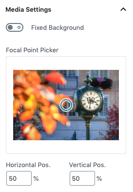
The background image or video can be set to a fixed position, allowing the text to move over the stationary cover background when scrolling on a page. Avoid overusing this feature.
Choosing the focal point will set the central focus area of the cover to help with cropping at different browser sizes.
Best Practices
- While a user can technically nest any component within a cover, it is recommended to only add headings to a cover.
- The text in a cover can be linked, creating an eye-catching way to help drive traffic to important pages of a site.
- As a general best practice, keep the heading style set to regular.
- Avoid adding too much text to a cover. It is best to keep headings short and concise.
- Avoid adding busy images or videos to a cover as they can make the text hard to read.
