Jump to: Checkbox | Dropzone Area | Field Error | Form Description | Input | Label | Messages | Radio Buttons | Select | Submit | Text Area
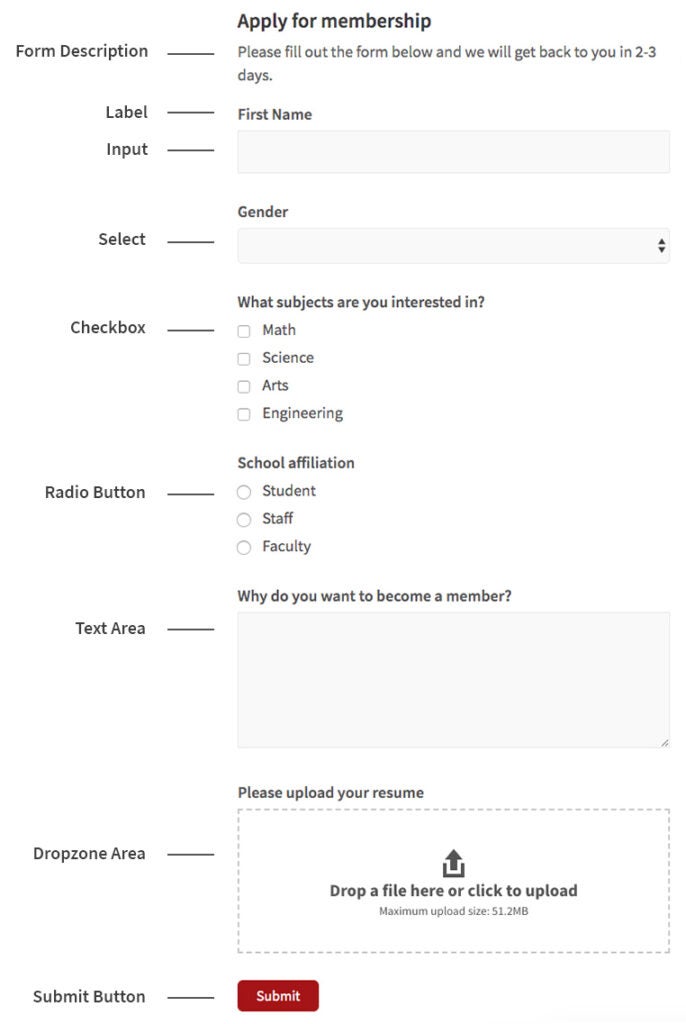
Forms are used to allow the user the ability to enter and submit information on a webpage.
Example

Best Practices
- Forms should start with the most general information needed first, and then move on to more detailed information.
- Make sure fields necessary to be submitted are labeled “required”.
- Use appropriate field types for the information to be collected. For instance, a name field would not require a large area text box, nor would a radio button list be appropriate. Similarly for lots of information necessary, do not use a single line text input box, but use a large area text box.
Checkbox
Checkboxes are used to allow the user to select multiple options in a list of options. Additionally, checkboxes are used as a required field to agree to a statement such as a terms of service for a website.
Example
HTML
<label for="input-checkbox">What subjects are you interested in?</label>
<label>
  <input type="checkbox" name="checkbox" id="input-checkbox-0" value="option0" checked>
  Math
</label>
<label>
  <input type="checkbox" name="checkbox" id="input-checkbox-1" value="option1">
  Science
</label>
<label>
  <input type="checkbox" name="checkbox" id="input-checkbox-2" value="option2">
  Arts
</label>
<label>
  <input type="checkbox" name="checkbox" id="input-checkbox-3" value="option3">
  Engineering
</label>
CSS
input[type="checkbox"] {
    margin: 0 10px 0 0;
}
Dropzone Area
The Dropzone Area is an interactive box in Forms that allow the user to drag a file onto the form and have it upload automatically
Example
Field Error
A field error is message or symbol used to convey an error to the user. This could mean a required field was not entered or an incorrect method of entry was used. Typically the form cannot be submitted until the error is fixed.
Example
CSS
.frm_blank_field label,
.frm_error {
  color: #B94A48;
}
Form Description
The form description appears below the form title to help describe what the form is about.
Example
Become a member
Fill out this form to be considered for membership.
Input
The Input fields in a form are specific boxes that allow the user to enter information.
Example
HTML
<label for="input-text">First name</label>
<input type="text" id="input-text">
CSS
input {
  font-family: 'Source Sans Pro', 'Helvetica Neue', Helvetica, Arial, sans-serif;
  font-size: 1.125rem;
  color: #555;
  background-color: #f9f9f9;
  border: 1px solid #e9e9e9;
  padding: 10px;
  width: 100%;
}

input:focus {
  border-color: #c8c8c8;
  outline: none;
}
Label
Labels are information next to a field (such as an input box) to inform the user of what the intended use is for that field.
Example
HTML
<label for="input-text">Occupation</label>
<input type="text" id="input-text">
CSS
label {
  display: block;
  margin-bottom: 5px;
  font-size: 1.125rem;
  font-weight: 600;
}
Messages
Messages are typically displayed after a user submits a form. Once a form has been submitted, a confirmation message is shown to assure the user their form has been submitted correctly.
Example
Radio Buttons
Radio button allow the user to choose one specific option in a list of multiple options to choose from.
Example
HTML
<label for="input-radio">School Affiliation</label>
<label>
  <input type="radio" name="radio" id="input-radio-0" value="option0" checked>
  Student
</label>
<label>
  <input type="radio" name="radio" id="input-radio-1" value="option1">
  Staff
</label>
<label>
  <input type="radio" name="radio" id="input-radio-2" value="option2">
  Faculty
</label>
CSS
input[type="radio"] {
    margin: 0 10px 0 0;
}
Select
Select allows the user to choose a specific option from a drop-down list menu of options.
Example
HTML
<label for="input-select">Gender</label>
<select id="input-select">
  <option selected="selected"></option>
  <option>Male</option>
  <option>Female</option>
  <option>I choose not to answer</option>
</select>
CSS
select {
  color: #555;
  font-size: 1rem;
  background: rgb(249, 249, 249);
  border: 1px solid rgb(233, 233, 233);
  width: 100%;
  height: 40px;
}
select:focus {
  border-color: rgb(102, 175, 233);
  outline: none;
}
Submit Button
The submit button is the final element in the form. A user clicks on this button to submit all of the information entered.
Example
HTML
<button type="submit" class="button-primary">Submit</button>CSS
.button-primary {
  display: inline-block;
  cursor: pointer;
  color: #fff;
  font-size: 1rem;
  font-weight: 400;
  line-height: 1.1em;
  text-decoration: none;
  padding: 0.5em 1.25em;
  margin: 0 0 1em;
  border: 1px solid #a51417;
  border-radius: 6px;
  background-color: #a51417;
  text-align: center;
}

.button-primary:hover {
  background-color: #fff;
  border: 1px solid #a51417;
  color: #a51417;
  text-decoration: none;
}
Text Area
A text area in a form allows for the user to input text information such as letters, numbers, or special characters.
Example
HTML
<label for="input-textarea">Why do you want to become a member?</label>
<textarea id="input-textarea"></textarea>
CSS
textarea {
  font-family: 'Source Sans Pro', 'Helvetica Neue', Helvetica, Arial, sans-serif;
  font-size: 1.125rem;
  color: #555;
  background-color: #f9f9f9;
  border: 1px solid #e9e9e9;
  padding: 10px;
  width: 100%;
}

textarea:focus {
  border-color: #c8c8c8;
  outline: none;
}