Jump to: Card with Image Header | Card with Text Header
Cards are containers that add visual impact to a group of content related to a specific topic. A card layout can be image or text focused.
Card with Image Header
In a card with an image header, the visual emphasis is on the image. The card content appears below the image.
Example
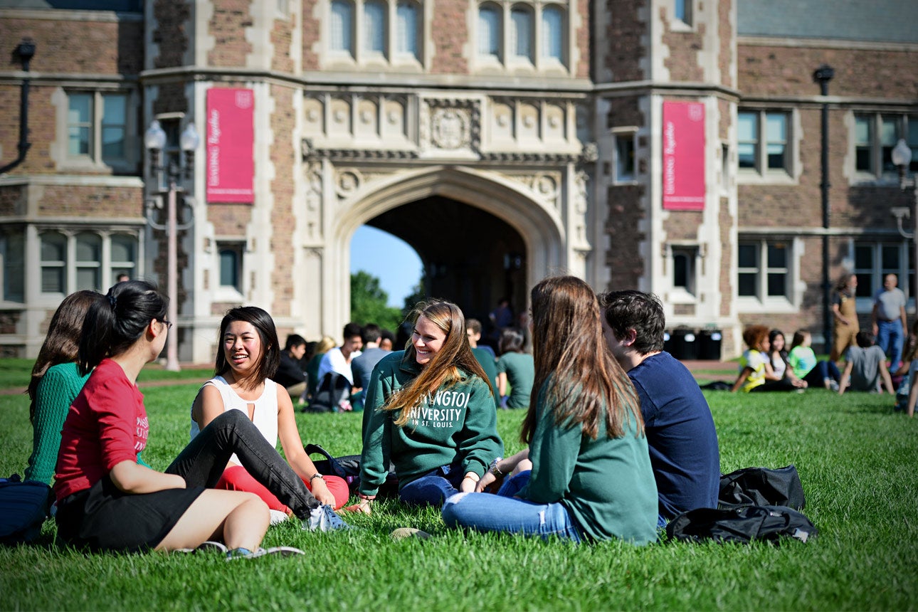
What to Do on Campus
Our campuses are easy to visit and, once you arrive, you’ll find a welcoming, open community.
What to Do on Campus
Our campuses are easy to visit and, once you arrive, you’ll find a welcoming, open community.
Design Considerations
A card with an image header is made up of two sections – an image and content area. The font size for the heading is 1.44rem/23.04px to account for longer text. The card has a light gray (#c8c8c8) border that helps create a subtle division between the content within a card and other content on the page. A 1px border (#eeeeee) appears at the bottom of the image to provide separation between an image with a white or lighter background and the text within the card. Read more information on border styling foundations.
By not adding an image, the image section will be removed.
Best Practices
- Use this card layout to draw attention to important content with imagery and color.
- When adding multiple cards to a page, maintain consistency with each card’s featured image by using the same size and aspect ratio. It is recommended that each image should be minimum 760px wide a 3:2 aspect ratio.
- Descriptive alt text should be added to images for accessibility compliance.
- Avoid adding too many cards in a row. It is recommended to have no more than two cards next to each other.
- Select images that are relevant and add value to your message.
Card with Text Header
In a card with a text header, the visual emphasis is on the heading. The card content appears below the header bar.
Example
What to Do on Campus
Our campuses are easy to visit and, once you arrive, you’ll find a welcoming, open community.
Our campuses are easy to visit and, once you arrive, you’ll find a welcoming, open community.
Design Considerations
A card with a text header is made up of two sections – a header bar and content area. The font size for the heading is 1.44rem/23.04px to account for longer text. The card has a light gray (#c8c8c8) border that helps create a subtle division between the content within a card and other content on the page. Read more information on border styling foundations.
By not adding a heading, the header bar will be removed. A 5px bottom border will be added to a card without a header to help anchor the card content.
To maintain accessibility standards, when a dark color option is chosen for the heading, the text color will change to white.
Best Practices
- Use this card layout to draw attention to important content with a bold heading and color.
- Keep text headers short and concise.
- Avoid adding too many cards in a row. It is recommended to have no more than two cards next to each other.
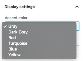
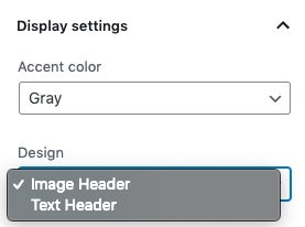
Component Options
The card template includes a heading (h3), paragraph and button, but can also include lists, quotes and separators.
The user can also choose an accent color for the card based on the WashU brand colors – red, gray, dark gray, turquoise, yellow and blue. The default color is gray and can be updated to the other color options.
The user has the option to choose the design of the card layout. They can choose to have an image header or text header.
Related Components
There are quite a few components that will work within a card, these include: