Jump to: Primary Buttons | Secondary Buttons
Buttons are clickable objects used to perform specific actions, such as taking users to other sections of a website.
Example
Design Considerations
Theme buttons have two visual characteristics – the red brand color and rounded corners. Red in the theme signals clickability, and so this color is also used on buttons.
Rounded corners suggest a physical button shape and help indicate clickability. Roundness also helps distinguish buttons from cards or boxes, which are used for other purposes.
Best Practices
- Use buttons to bring attention to call-to-action links.
- Buttons should be used independently from text blocks. Do not include buttons within paragraphs.
- When placing buttons on a site, place them in their own row, but make sure they are nested in proximity (below or alongside) text blocks that help support the call-to-action.
Primary Buttons
The primary button is a subset of the button category. Through its color, shape and size this button is designed to attract attention.
Example
Default state

Hover state

Design Considerations
The primary button stands out on the page by emphasizing the red brand color, used for the fill of the button. Contrasting white text meets accessibility standards and enhances the button’s readability. This button inverts upon hover to signal that it is a clickable object.
Best Practices
- Use primary buttons for your main call-to-action links.
- Primary buttons convey more important, more likely, or more desired actions and their placement should stand out.
- Use primary buttons sparingly. Overuse of primary buttons will desaturate your message and make other calls-to-action seem less important than it should be.
- It is okay to pair a primary button with a secondary button if necessary. However, avoid pairing two of the same buttons.
HTML
<a href="https://wustl.edu" class="button-primary">Primary Button</a>CSS
.button-primary {
  display: inline-block;
  color: #fff;
  font-size: 1rem;
  line-height: 1;
  letter-spacing: 0.1em;
  text-decoration: none;
  padding: 0.75em 1.75em;
  margin: 0 1.25em 1.25em 0;
  border: 1px solid #a51417;
  border-radius: 0.375em;
  background-color: #a51417;
  text-align: center;
}

.button-primary:hover {
  background-color: #fff;
  border: 1px solid #a51417;
  color: #a51417;
  text-decoration: none;
}
Secondary Buttons
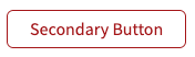
The secondary button is a subset of the button category. This button does not stand out as much as the primary button.
Example
Default state
Hover state

Design Considerations
Also called an outline button, this button has no fill color, and instead has a red border with red text to signal clickability. Because secondary buttons are intended for less important links, the secondary button shows less red than the primary button. Similar to the primary button, this button inverts upon hover to engage users and to signal clickability.
Best Practices
- Use secondary buttons for your less important call-to-action links.
- Secondary buttons convey less important, less likely, or less desired actions and should not stand out as much as primary buttons.
- When pairing buttons, avoid pairing two of the same buttons. It is okay to pair a secondary button with a primary button.
HTML
<a href="https://wustl.edu" class="button-secondary">Secondary Button</a>CSS
.button-secondary {
  display: inline-block;
  color: #a51417;
  font-size: 1rem;
  line-height: 1;
  letter-spacing: 0.1em;
  text-decoration: none;
  padding: 0.75em 1.75em;
  margin: 0 1.25em 1.25em 0;
  border: 1px solid #a51417;
  border-radius: 0.375em;
  text-align: center;
}

.button-secondary:hover {
  background-color: #a51417;
  color: #fff;
  text-decoration: none;
}