Headings create a visual and informational hierarchy on a page.
Default Example
Heading 2
Heading 3
Heading 4
Heading 5
Heading 6
Alternate Heading Example
Heading 2
Heading 3
Heading 4
Heading 5
heading 6
Design Considerations
The heading font style is bolder and a darker gray (#3d3d3d) than other text styles so that it stands out and helps users quickly scan the sections on a page. To give users of the web theme a more unique heading style for their content, alternate heading styles were designed for H2 – H3. This allows users to have a bolder style while still using the heading block, following accessibility standards for screen readers.
Component Options
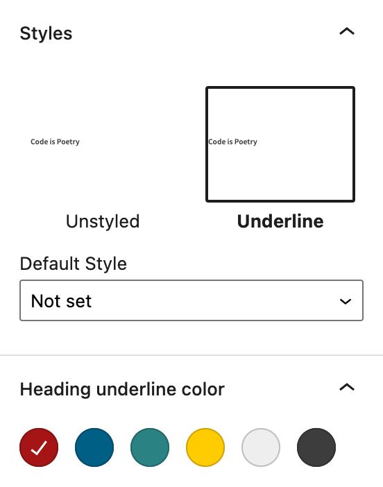
The heading block has alternate styling options available for H2-H6. For H2, the user can choose to add a short underline in one of the WashU brand colors – red, blue, turquoise, yellow, light gray and dark gray. The default color is red and can be updated to the other color options. For H3-H6, the user can choose to add a 1px #c8c8c8 underline.
Best Practices
- Use headings to help create levels of hierarchy on a page.
- A heading should clearly describe what the section of content is about.
- Use the alternate heading options to have styled headings on a page. Avoid using underlines, colors or other text changes to create your own headings.
- For accented headings to stand out, choose a single accent color rather than introducing multiple accent colors across your site.
HTML
<h2>Heading 2</h2>
<h3>Heading 3</h3>
<h4>Heading 4</h4>
<h5>Heading 5</h5>
CSS
h2, h3, h4, h5, h6 {
  color: #3d3d3d;
  margin: 0 0 0.5em;
  line-height: 1.25;
  font-weight: 600;
}

h2 {
  font-size: 1.602rem;
}

@media screen and (min-width: 37em) {
  h2 {
    font-size: 2.197rem;
  }
}

h3 {
  font-size: 1.424rem;
}

@media screen and (min-width: 37em) {
  h3 {
    font-size: 1.76rem;
  }
}

h4 {
  font-size: 1.266rem;
}

@media screen and (min-width: 37em) {
  h5 {
    font-size: 1.4rem;
  }
}

h5,
h6 {
  font-size: 1.125rem;
}