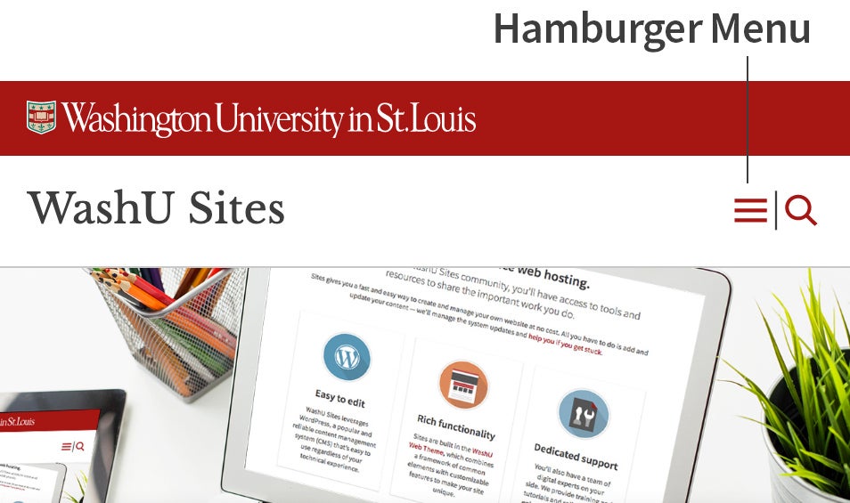
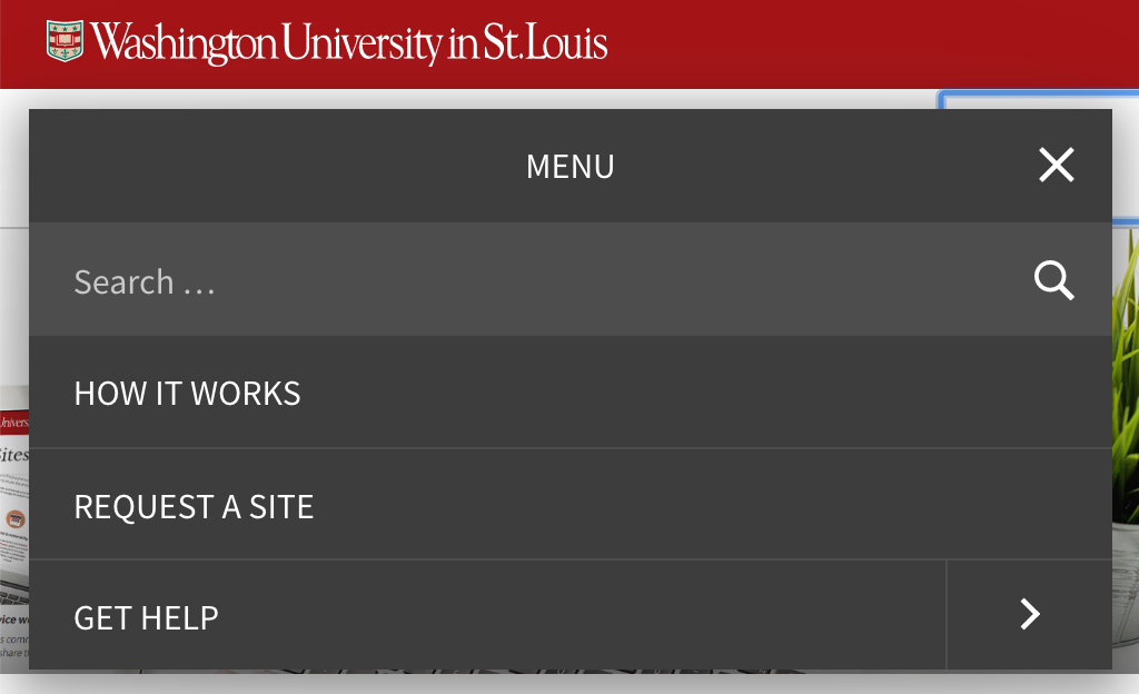
Mobile navigation is the appearance and function of the primary site navigation links on a mobile browser. The presence of mobile navigation is indicated by an icon with three thin horizontal lines (often called a hamburger menu icon). The elements within the mobile navigation are by default hidden on the mobile browser. To view the mobile navigation, the user must click the menu icon.
Example


Design Considerations
Responsive web designs adapt to a user’s browser size, screen size, or device, yet still provide a functional website. Otherwise, default navigation and vital content becomes difficult or impossible to read on small screens. A mobile menu icon is now a recognized for accessing mobile navigation. Alongside the mobile icon the WashU Web Theme adds a magnifying glass to signify “search”. When clicked, a search input field displays which allows a user to input search terms.
Best Practices
- Use mobile navigation on all sites that are more than a single page.
- The mobile menu icon should appear on the right side of the header.