Layout refers to how elements on a page are arranged. There are many factors that affect layout including the use of columns, a grid system, and breakpoints.
Web theme page structure
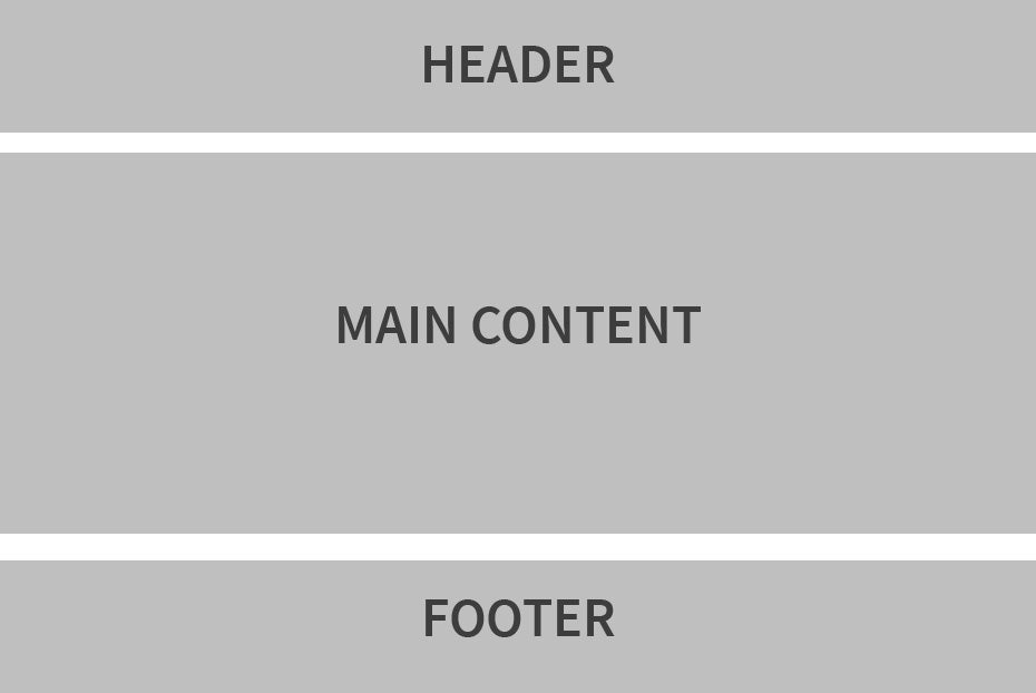
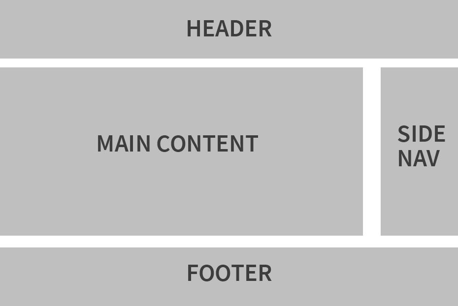
The web theme has two layouts that it uses. For home pages and some subpages, a full width single column layout is used. For most subpages, a two column layout is used.


Considering screen sizes
When laying out a page, it’s important to understand who the user is and what size screens they commonly use. When designing for mobile, it would make sense to take a single column page structure approach, but for desktop, you may have multiple columns to display content. Fortunately, breakpoints are a way to allow a site to have both layouts, but only one displays depending on the screen size.

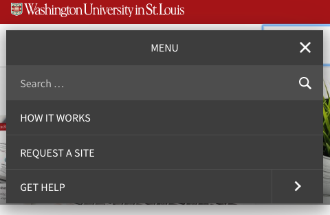
The above image shows how the page is structured in the web theme for desktop displays. However, in mobile browsers, the navigation is structured differently as seen below. This allows for a better user experience depending on the screen used.

