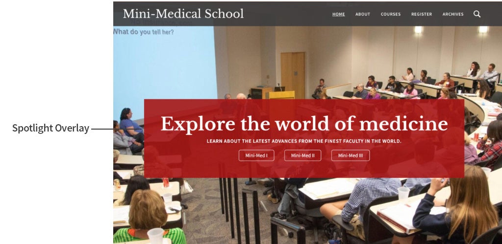
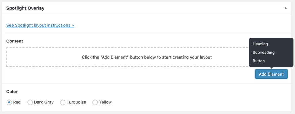
Spotlight Overlay is used in the “Condensed” (or “Spotlight”) version of the web theme header. This container is a color block with text and a button appearing on a large featured image.
Example

Design Considerations
The spotlight overlay was designed to follow accessibility guidelines and ensure good readability. A semi-transparent rectangle allows for visibility of the image underneath while keeping the text and buttons accessible.
An important design consideration was how this component would respond to different browser sizes on desktop and mobile. The overlay has variable widths that automatically resize dependent on the browser size. This allows for maximum accessibility for the text while not intruding on the background image.
Component Options
- Color options: Red, dark gray, turquoise and yellow.
- Text options: heading and subheading
- Optional button

Best Practices
- Use Spotlight Overlay to create visual impact when text and a button overlays in image.
- When changing the featured image, ensure that the color used for the rectangle looks good in context. For example, if the majority of your image is red, choosing a rectangle color other than red may aid contrast and oversaturation of a single color.